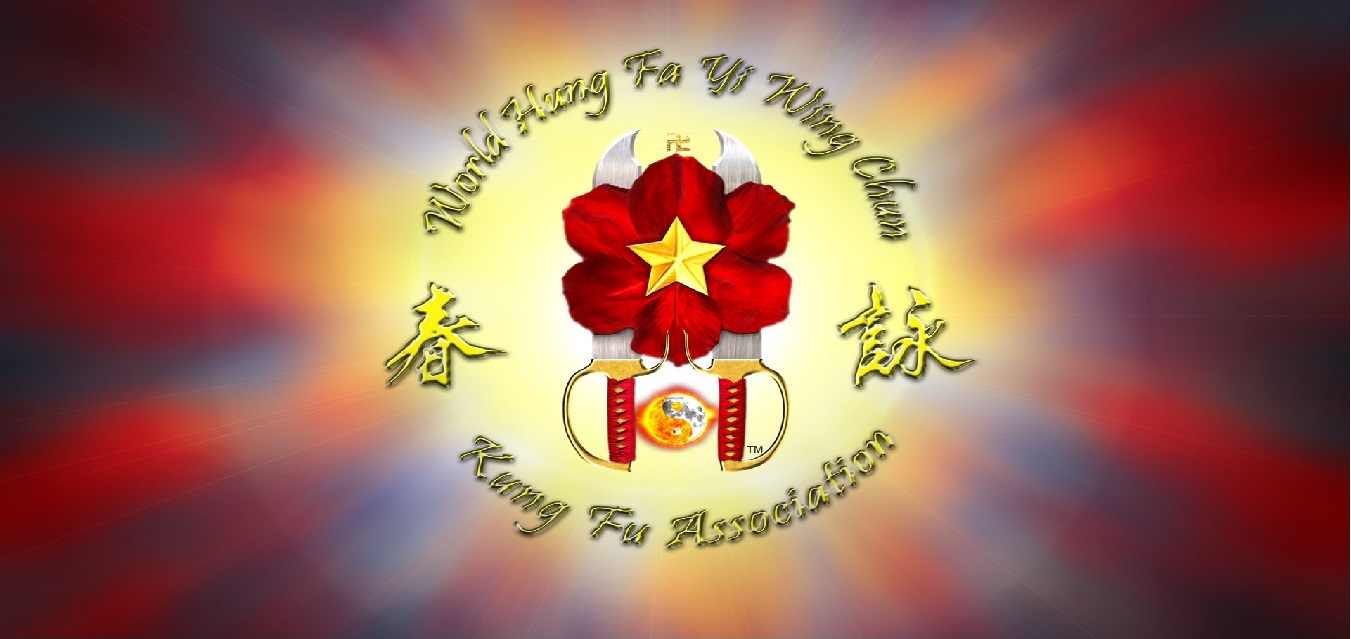
A Brief History of the HFY logo
As a HFY family member I wanted to address the question that has come up once
again regarding the origins of the HFY logo. This history will provide an
accurate account of the logo evolution while also keeping the so-called "HFY
Champions" from continuing to spread misinformation about HFY and push their own
agendas.
Back in the early 1980's, GM Gee was working with a clothing supply company to
provide new kung fu uniforms for his students. This company had a designer who
worked closely with GM Gee and his strict criteria of what was to be include in
the logo. The result was a series of three logos that were developed for the
HFYWCKF lineage.
Evolution of the logos
All three versions of the logo were used at one point in time from early 1980's
until the present. Through the years, the logo was standardized and refined by
Mathew Kwan, himself a 9th generation disciple in the HFYWCK lineage.
1) 2 butterfly swords sitting outside the red plum flower
2) Chinese characters sitting inside
the red plum flower
3) The current logo which represents
the HFYWCKF lineage today
Symbols and their meanings
The petals of the red flower represent the 6 different realities (smell, hear,
taste, feel, see, mind), the six gates.
The star represents the 5 elements (wood, metal, fire, earth, water).
The yin yang symbol represents the HFY connection to Daoism.
The reverse swastika symbol represents the HFY connection to Buddhism.
The 2 butterfly swords represent the wing chun weapon.
William E.
